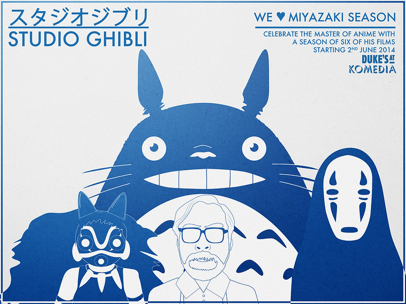
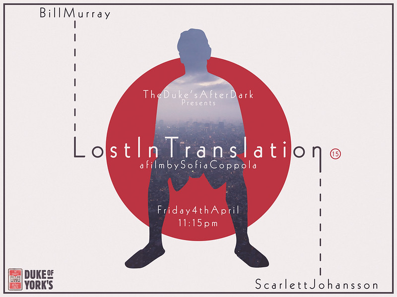
Bob Prosser works in Sussex MFM's media store, but also has a double life on the side of being a kick-ass graphic designer. He works with the Dukes cinema franchise to make/ reimagine posters for one-off screenings, film seasons and festivals.
His work is really clever, and he manages to convey his own style which also staying true to the theme of each film/ show. The colour themes used are minimalistic and simple. which comes across very strikingly. The artwork typically looks vector-based rather than hand drawn, and effectively uses bold shapes and shading.
I absolutely love all of these and I think the style is so appropriate for an attention-grabbing advertisement. Maybe I should create some sort of poster/ cover art for my animation?
Sources: http://weeklymonster.tumblr.com/ https://www.facebook.com/DukesAfterDark http://www.hellomynameisbob.co.uk/


