Showing posts with label Concept Art. Show all posts
6 January 2015
Designing the Woodcutter's House
I doodled these very roughly with red biro white I experimented with shape and size. I went over them with my black artist's marker, then shaded them with my grey pro marker. I made two main designs, on the left and right hand sides, and on the bottom of the page is each of the two as seen from the side. I think I much prefer the one on the right: it looks more interesting both from the front and the side, and I think the proportions and perspective are a bit easier to draw than the left-hand one.
The next step will be designing the interior, then colouring and texturing!
5 January 2015
The Making of Sleeping Beauty
This video that I found on YouTube is amazing. The things I found most interesting to learn of were the medieval tapestries and Persian arts used as reference for the art style; and the amount of live action recording used as source material for the animation. each background took up to 10 days to paint by hand! I can't even imagine trying to do something of that depth for my own animation!
Walt Disney mentions being inspired by the classical music piece 'Sleeping Beauty', but doesn't actually talk in depth about the route of the folktale on which the story is based, and about his decision to adapt it in a certain way.
4 December 2014
Sleeping Beauty: Concept Art
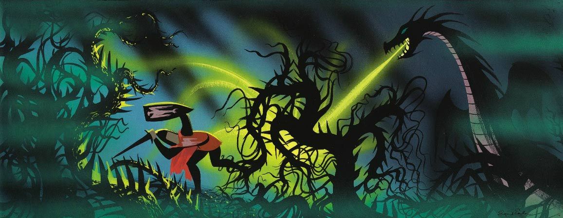
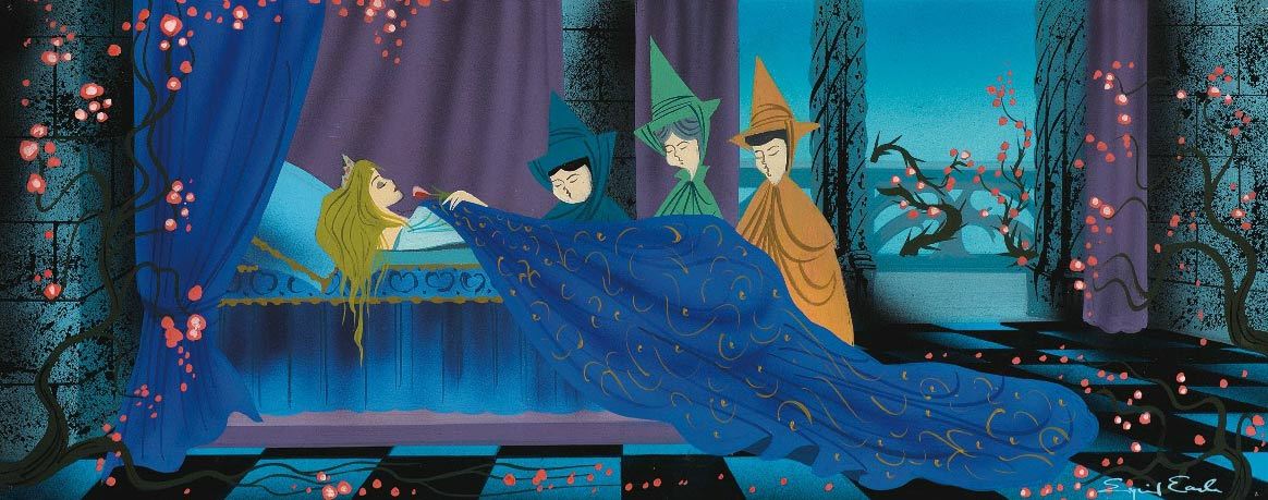
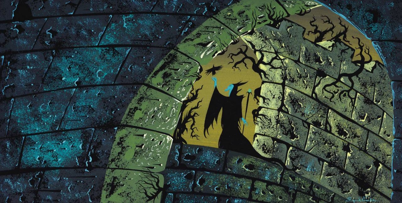
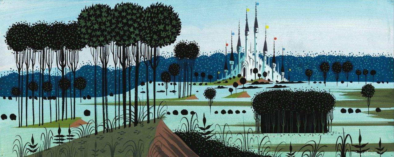
Concept art for Sleeping Beauty (1959) by Eyvind Earle.
"All my foregrounds were tapestry designs of decorative weeds and flowers and grasses. And since it is obvious that the Gothic style and detail evolved from the Arabic influence acquired during the Crusades, I found it perfectly permissible to use all the wonderful patterns and details found in Persian miniatures. And since Persian miniatures had a lot in common with Chinese and Japanese art, I felt it was OK for me to inject quite a bit of Japanese art, especially in the closeup of leaves and overhanging branches." - Eyvind Earle
I love love love this concept art, to me it perfectly encapsulates the essence of what concept artwork is about - telling a story in pictures, giving a sense of the film to come but not sticking directly to the final aesthetic style. The scenes are highly emotive and key points in the narrative, either showing important locations or pivotal plot points being acted out. The colours are rich and in this particular work the landscapes are very 2D picturesque, with hard edges and angles. It almost looks like a tapestry!
All pictures and quote source: http://cartoonbrew.tumblr.com/post/103477646877/concept-art-gallery-eyvind-earle-the-value-of
"All my foregrounds were tapestry designs of decorative weeds and flowers and grasses. And since it is obvious that the Gothic style and detail evolved from the Arabic influence acquired during the Crusades, I found it perfectly permissible to use all the wonderful patterns and details found in Persian miniatures. And since Persian miniatures had a lot in common with Chinese and Japanese art, I felt it was OK for me to inject quite a bit of Japanese art, especially in the closeup of leaves and overhanging branches." - Eyvind Earle
I love love love this concept art, to me it perfectly encapsulates the essence of what concept artwork is about - telling a story in pictures, giving a sense of the film to come but not sticking directly to the final aesthetic style. The scenes are highly emotive and key points in the narrative, either showing important locations or pivotal plot points being acted out. The colours are rich and in this particular work the landscapes are very 2D picturesque, with hard edges and angles. It almost looks like a tapestry!
All pictures and quote source: http://cartoonbrew.tumblr.com/post/103477646877/concept-art-gallery-eyvind-earle-the-value-of
21 November 2014
Artwork of Chris Battle
Source: Animation Insider, (2013). Chris Battle. [online] Available at: http://www.animationinsider.com/2013/02/chris-battle/ [Accessed 21 Nov. 2014].
Chris Battle is a character design artist, and was interviewed last year by Animation Insider. he work on many of the cartoons I watched during my formative years of my childhood, such as Powerpuff Girls, Samurai Jack and Dexter's Laboratory on Cartoon Network.
"I’m a typical night owl artist, and often stay up late drawing, so I usually roll into work around 10 AM, grab some coffee, and settle in. Sometimes I need to read a new script, but most often I’m busy attacking already in-progress designs for the latest script or storyboard. The day moves pretty swiftly once the drawing begins, but I always take time to walk around and see what everyone else is doing (It helps to get an idea of what the entire show is looking like instead of just your one little area), and usually try to get outside for lunch with friends– it’s important to actually see some sunlight and get fresh air to recharge your batteries. Usually by 7 PM I call it a day, unless I’m in the middle of a drawing and in “The Zone”; Sometimes you can’t stop while the drawings are flowing!"Chris describes the process by which he works; he will do initial sketches on paper then scan them into photoshop and go over them digitally with a wacom cintiq.
"Is there any advice you can give for an aspiring animation student or artist trying to break into the business?
1) It may sound cliché, but you should just draw like crazy. Draw plenty from real life. Study from everyone and everything that’s come before you. Draw what you love, but also make sure you draw what’s most difficult for you– push yourself to grow outside of your comfort zone. Always keep growing as an artist; Always keep moving forward creatively.
2) Keep your digital skills up to date– Photoshop is as essential as paper and pencil these days; Illustrator’s a close second. A Cintiq is a must– But if it’s too pricey for you, a Wacom tablet will do.
3) Get your work out there… You HAVE to maintain a web presence these days, be it on your own website, a free blog or portfolio site like Deviant Art/Flickr, or your own YouTube channel. Make it easy for industry people to find your work."
11 November 2014
10 November 2014
Concept Art from Monsters, Inc.
These are character designs from the early stages of production, by Nicholas Marlet. You can see that they seem quite free-form, with visible rough sketch marks still on the page. The colours are muted, to just give a suggestion or hint of the shading and colouring of the creatures. The style is spindlier and creepier than usual Disney, which shows that they have not been refined and reproduced multiple times yet in the studio. They almost look like the work of Chris Riddel, one of my favourite children's illustrators. Indeed, they look more like static illustrations than actual designs for moving, living characters. The physics of some would be too disproportionate to animate properly/ realistically.
Source: disneyconceptsandstuff.tumblr.com/post/102219297046/character-designs-from-monsters-inc-by-nicolas
For neither of the above images to I have a credit for the actual artist, as it was not listed on the course site I found them on. They are taken from the visual development stage of the film, when basic setting, character, colour key etc ideas were being formulated. The picture is roughly done, in pen and marker it seem,s with just enough detail, colour and shading to suggest the look of the scene in the final finished film. Images like these might also be the kind to appear on a storyboard, as they have basic blocking included and very decisive camera angles.
Source: disneyconceptsandstuff.tumblr.com/post/102224963929/visual-development-from-monsters-inc
Source: disneyconceptsandstuff.tumblr.com/post/102219297046/character-designs-from-monsters-inc-by-nicolas
These character design/concept art pieces by Carter Goodrich are even less coloured than the previous ones, and instead rely more heavily on shading and depth to convey a sense of atmosphere rather than actual form. They are pencil sketches, but intricately done, and give the additional information of the environments that the characters might appear in or the actions they will partake in. Pieces like these would be great to use in a pitch of the story, to communicate the feel and the purpose of the tale.
Source: disneyconceptsandstuff.tumblr.com/post/102220778355/character-designs-from-monsters-inc-by-carter
For neither of the above images to I have a credit for the actual artist, as it was not listed on the course site I found them on. They are taken from the visual development stage of the film, when basic setting, character, colour key etc ideas were being formulated. The picture is roughly done, in pen and marker it seem,s with just enough detail, colour and shading to suggest the look of the scene in the final finished film. Images like these might also be the kind to appear on a storyboard, as they have basic blocking included and very decisive camera angles.
Source: disneyconceptsandstuff.tumblr.com/post/102224963929/visual-development-from-monsters-inc
All of the above images are colour keys by Dominique Louis. They are painted with either pastel or chalk it seems, to give rich and complete tones to the images. These keys show the atmosphere of each scene, without the drawings being terribly intricate. It gives and sense of the mise-en-scene. In some shots, the blue colours suggest night time, loneliness, isolation and the urban, while the ones with warmer pink and golden tones are more inviting, and we expect it to be a happier scene. Yet all of these examples show the mood without even featuring actors, dialogue or plot.
9 November 2014
Sher Khan from The Jungle Book
Drawing by Milt Kahl, source: 2dtraditionalanimation.tumblr.com/post
The tiger both looks realistic and cartoonish in equal measures; his proportions look believable but his face and human qualities, like the frown and exaggerated lower jaw. Kahl's work is a good example of how to draw an animal character while instilling it with your own style and aesthetic, and to fit a certain kind of purpose.
8 November 2014
The Art of Brittney Lee: Blog
I came across Brittney Lee through Twitter (handle: @britsketch), when I started following numerous animators and artists. This was just before the release of Frozen (2013), and I found that Lee was working as a development artist on the project, and would regularly post images of her character and world design process. I started to follow her blog also; britsketch.blogspot.com for inspiration. I loved following her process and fell in love with her particular vector-cased, paper-cutout looking aesthetic. I started to adore the world of Frozen without even having seen the film, just because i saw how much work and skill went in to the development. It has helped me to understand the pre-production and design process, and given me a template to use for my own animation's development.
Lee developed the rosemaling designs that were used in the clothes and tapestries throughout the film, and was tasked with designing Elsa's hair and the ice palace she lives in.
Source for all images: britsketch.blogspot.co.uk/frozen-elsa-and-her-ice-palace
4 November 2014
Making of How to Train Your Dragon 2
It was interesting to see the drawing and 2D concept work that went into the 3D CG Dreamworks film. The model sheets, though we don't see them close up or at great length, look really detailed and intricately made. There are a few seconds included at different points of the animatic, so we can see really easily how the storyboard translates to the final finished film. We get interviews with the voice actors, producers, designers and character animators.
23 October 2014
Male Character Brainstorming
So this evening I was just messing around, doodling with some markers, and decided to attempt some character idea sketches. I am a little more hesitant about drawing the crane/girl than the woodcutter, so went for the latter to start with. Rather than being an older man, who might seem a little creepy or possessive if he was partnered with a younger girl, I wanted to bring some youth into the character and make him more similar in age to the crane. He can be a good-hearted, humble man who is struggling though life's challenges; trying to make a place for himself in the world through honest work.
The sketches I did, I think, sort of reflect his character in his features. He is poor, so thin and gangley and tall, with tousled hair and a large nose that dominates most of his face. His eyes are small and rounded, and look thoughtful and concerned. His overall demeanor is laid-back yet attentive.I based his facial features off a mix of the male protagonist in the Paperman (Disney) and one of my friends.
16 October 2014
11 October 2014
Fox Design
Last night on Photoshop I decided to mess around with my Bamboo tablet and draw some characters. Most of them turned out so rubbish that I don't even want to showcase them on this blog, but I did a kind of cute fox which I thought I should include. It is terribly roughly drawn and not exactly as I would like it; but since it is just for practice and not the design of an actual character I might just leave it for now.
7 October 2014
The Art of Adventure Time
A collection of tips on how to draw Jake by storyboard revisionist and supervisor Ian Jones-Quartey.
By Penn Ward
By Rebecca Sugar
By Adam Muto
All above images from the upcoming Adventure Time book 'The Art of Ooo,' taken from an exclusive Cartoon Brew preview. Source: cartoonbrew.com/books/adventure-time-the-art-of-ooo-preview-exclusive
Subscribe to:
Posts (Atom)