
Showing posts with label Inspiration. Show all posts
Showing posts with label Inspiration. Show all posts
12 January 2015
Inspiration: Random Little YouTube Animation
This video is gorgeous, and the painting looks liek it could have been done by hand in photoshop or something! I love this aesthetic, it looks delicate which contrasts beautifully with the intense action.

6 January 2015
Adventure Time - The Art of Ooo 2
Below are a lot of guidelines on the drawing of the main characters; Finn and Jake, by the show's creators. They are used to help the animators keep their work consistent and the look of the show always fluid. I am already totally in love with this book, as it not only shows finished pieces and grabs from the show, but also all of the concept and development art. It discusses the processes the artists had to go through to create and finalize all of their characters and worlds, which is super useful to me!


Adventure Time: The Art of Ooo 1


The two above images are exterior views of the Treehouse, Home to Finn and Jake. It shows the scene during two different times of day: one in the dark of night and one in the soft glow of sunrise. i love how the colours change between the two and give a distinctive mood to each picture.


Tangled Storyboards


Glen Keane Design Notes (Rephrased by Shiyoon Kim)


'Some great quotes from Bill Moore, famous design teacher at Chouinard, establishing a great way of approaching and studying shapes' - Shiyoon Kim. All above taken from Kim's Tumblr : shiyoonkim.tumblr.com/
5 January 2015
The Making of Beauty and the Beast
Unlike the 'Making of Sleeping Beauty' video, this one delves deeper into the issues concerting the adaptation of a fairy tale to become an animated feature film. It compares the original folk story and the adapted version. The story team working on the film changed the character of Belle by fleshing her out; making her more humble and quirky. They created new characters to expand the story further from the original. Comedy is added to a gloomy story, as well as commentary, in the form of the Beast's servants. the villain, Gaston was added to thicken the plot. He acts as a foil for Beast.
This video focuses a lot more on the character design and development rather than the concept art and background design.
This video focuses a lot more on the character design and development rather than the concept art and background design.
The Making of Sleeping Beauty
This video that I found on YouTube is amazing. The things I found most interesting to learn of were the medieval tapestries and Persian arts used as reference for the art style; and the amount of live action recording used as source material for the animation. each background took up to 10 days to paint by hand! I can't even imagine trying to do something of that depth for my own animation!
Walt Disney mentions being inspired by the classical music piece 'Sleeping Beauty', but doesn't actually talk in depth about the route of the folktale on which the story is based, and about his decision to adapt it in a certain way.
Trailer: Song of the Sea
By cartoon Saloon and Tom Moore (of the Secret of Kells fame)
I haven't been able to watch it yet as it hasn't come out in Ireland on general release and I can't find it online to my disappointment, so I'll have to make do with the trailer for now. It looks visually very similar to the Secret of Kells with the forced perspective, 2D flattened style. Some of the elements such as the round character heads, the centering of many subjects, and the theme of peering through doors/windows reappear also. The light is also used to great effect in dappling and reflections on water ripples.
I haven't been able to watch it yet as it hasn't come out in Ireland on general release and I can't find it online to my disappointment, so I'll have to make do with the trailer for now. It looks visually very similar to the Secret of Kells with the forced perspective, 2D flattened style. Some of the elements such as the round character heads, the centering of many subjects, and the theme of peering through doors/windows reappear also. The light is also used to great effect in dappling and reflections on water ripples.
3 January 2015
The Art of Victoria Ying
All below images were sourced from Victoria's Twitter handle @victoriaying

This above one I particularly love, because of its simplicity yet it evokes so much emotion and so many feelings. The style is really clear without being too complex. After seeing this image it got me thinking about making colour in my story really prominent, and perhaps using it a lot more obviously. Perhaps different scenes could be block coloured in different groups of shades corresponding to the plot or the mood of it?
The image at the bottom of this post in purple has the same effect. it is unrealistic but still believable. The colours add another dimension of meaning and feeling.


This above one I particularly love, because of its simplicity yet it evokes so much emotion and so many feelings. The style is really clear without being too complex. After seeing this image it got me thinking about making colour in my story really prominent, and perhaps using it a lot more obviously. Perhaps different scenes could be block coloured in different groups of shades corresponding to the plot or the mood of it?
The image at the bottom of this post in purple has the same effect. it is unrealistic but still believable. The colours add another dimension of meaning and feeling.
28 December 2014
Drawing Tips: Rad Sechrist
Here is a (relatively small, I must say) compilation of tips and tricks for character drawing from one of Dreamworks' animators, Rad Sechrist. I Follow him on Twitter, Blogger and Tumblr (from which all the below images are). His work and instructions have certainly helped me with my own figure drawing, especially his points about 'pushing' angles and proportions which can give characters a more cartoonish look that's really suited for animation. I've been practicing these techniques whenever I sketch people now, and look for their skeleton inside their frame and to see which way they curve. radfordsechrist.tumblr.com

'short-hands for boarding'


 |
Model Sheets by Aaron Blaise
 |
| Source: https://twitter.com/AaronBlaiseArt/status/531234566384914432/photo/1
'Here are some keys from a Tembo pencil test I did a couple of years ago.'
|
 |
| Source: https://twitter.com/AaronBlaiseArt/status/544136826890776576/photo/1
'Some character sketches from early in the process of designing Yao from Mulan. 1996ish.'
|
 |
| Source: https://twitter.com/AaronBlaiseArt/status/544329806121537537/photo/1
'This is a page of Rajah expressions I did when designing him for Aladdin.'
|
 |
| Source: https://twitter.com/AaronBlaiseArt/status/544331382622015488/photo/1
'A page of thumbnail sketches from one of the shots I animated in Mulan. We do these to plan the animation. '
|
18 December 2014
Characters looking into camera = truthfulness
'When tellers look people in the eye when they are speaking to them, Euro–North Americans perceive honesty and sincerity in their content. Thus as Michael Roemer (21) describes, when a film character directly faces the camera, audiences will understand truthfulness' - Greenhill and Kohm, 2013References:
Greenhill, P. and Kohm, S., "Hoodwinked! and Jin-Roh: The Wolf Brigade." Marvels & Tales, 27 (1), 2013, pp. 93
Roemer, Michael. “The Surfaces of Reality.” Film Quarterly 18.1 (1964): 15–22.
5 December 2014

4 December 2014
Sleeping Beauty: Concept Art
Concept art for Sleeping Beauty (1959) by Eyvind Earle.
"All my foregrounds were tapestry designs of decorative weeds and flowers and grasses. And since it is obvious that the Gothic style and detail evolved from the Arabic influence acquired during the Crusades, I found it perfectly permissible to use all the wonderful patterns and details found in Persian miniatures. And since Persian miniatures had a lot in common with Chinese and Japanese art, I felt it was OK for me to inject quite a bit of Japanese art, especially in the closeup of leaves and overhanging branches." - Eyvind Earle


I love love love this concept art, to me it perfectly encapsulates the essence of what concept artwork is about - telling a story in pictures, giving a sense of the film to come but not sticking directly to the final aesthetic style. The scenes are highly emotive and key points in the narrative, either showing important locations or pivotal plot points being acted out. The colours are rich and in this particular work the landscapes are very 2D picturesque, with hard edges and angles. It almost looks like a tapestry!
All pictures and quote source: http://cartoonbrew.tumblr.com/post/103477646877/concept-art-gallery-eyvind-earle-the-value-of
"All my foregrounds were tapestry designs of decorative weeds and flowers and grasses. And since it is obvious that the Gothic style and detail evolved from the Arabic influence acquired during the Crusades, I found it perfectly permissible to use all the wonderful patterns and details found in Persian miniatures. And since Persian miniatures had a lot in common with Chinese and Japanese art, I felt it was OK for me to inject quite a bit of Japanese art, especially in the closeup of leaves and overhanging branches." - Eyvind Earle
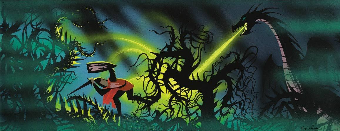
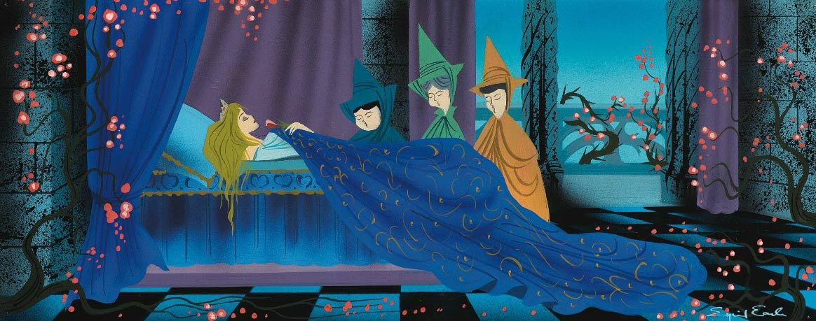
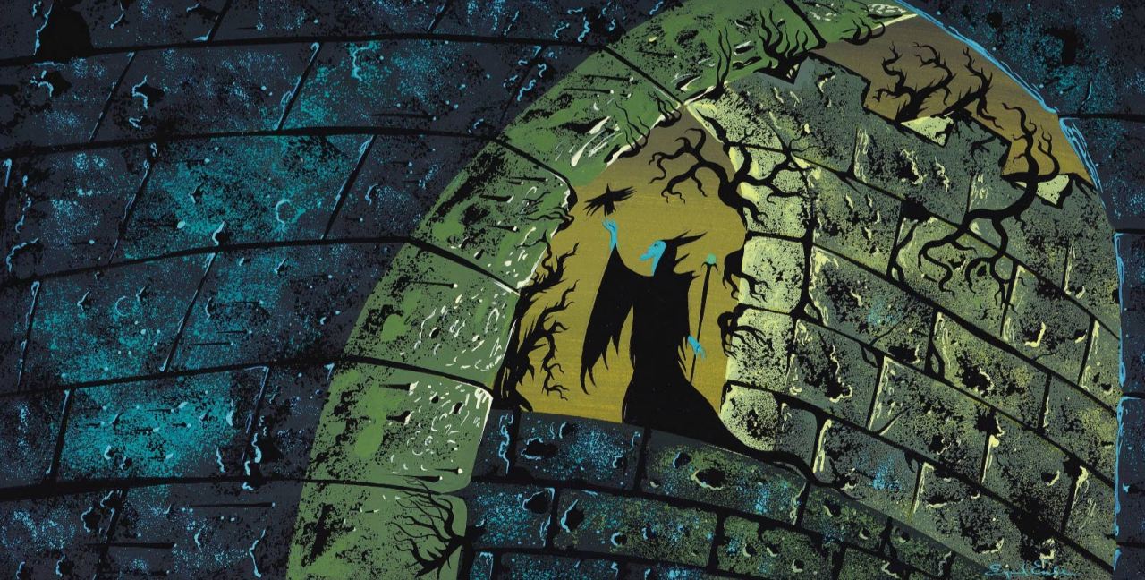
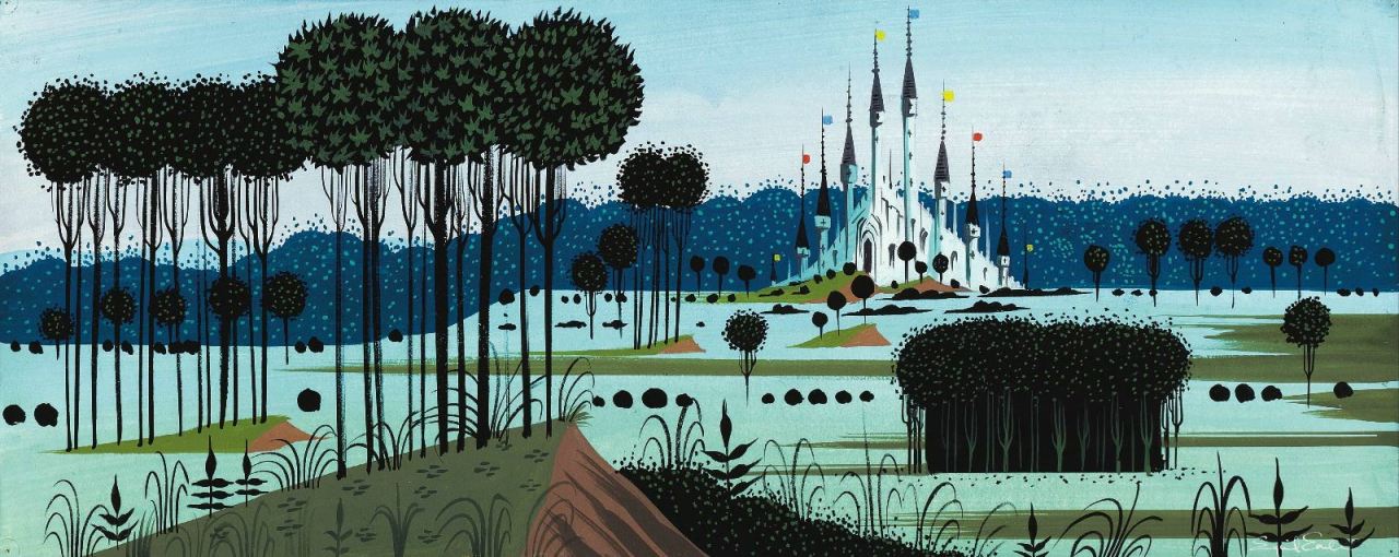
I love love love this concept art, to me it perfectly encapsulates the essence of what concept artwork is about - telling a story in pictures, giving a sense of the film to come but not sticking directly to the final aesthetic style. The scenes are highly emotive and key points in the narrative, either showing important locations or pivotal plot points being acted out. The colours are rich and in this particular work the landscapes are very 2D picturesque, with hard edges and angles. It almost looks like a tapestry!
All pictures and quote source: http://cartoonbrew.tumblr.com/post/103477646877/concept-art-gallery-eyvind-earle-the-value-of
Subscribe to:
Posts (Atom)