Showing posts with label Film. Show all posts

6 January 2015

Tangled Storyboards


'These sketches are all pen on paper with tone added in Photoshop.' From http://sevencamels.blogspot.ca/2010/11/boarding-for-2d-vs-3d.html


5 January 2015

The Making of Beauty and the Beast

Unlike the 'Making of Sleeping Beauty' video, this one delves deeper into the issues concerting the adaptation of a fairy tale to become an animated feature film. It compares the original folk story and the adapted version. The story team working on the film changed the character of Belle by fleshing her out; making her more humble and quirky. They created new characters to expand the story further from the original. Comedy is added to a gloomy story, as well as commentary, in the form of the Beast's servants. the villain, Gaston was added to thicken the plot. He acts as a foil for Beast.
This video focuses a lot more on the character design and development rather than the concept art and background design.

The Making of Sleeping Beauty


This video that I found on YouTube is amazing. The things I found most interesting to learn of were the medieval tapestries and Persian arts used as reference for the art style; and the amount of live action recording used as source material for the animation. each background took up to 10 days to paint by hand! I can't even imagine trying to do something of that depth for my own animation!
Walt Disney mentions being inspired by the classical music piece 'Sleeping Beauty', but doesn't actually talk in depth about the route of the folktale on which the story is based, and about his decision to adapt it in a certain way.

Trailer: Song of the Sea

By cartoon Saloon and Tom Moore (of the Secret of Kells fame)


I haven't been able to watch it yet as it hasn't come out in Ireland on general release and I can't find it online to my disappointment, so I'll have to make do with the trailer for now. It looks visually very similar to the Secret of Kells with the forced perspective, 2D flattened style. Some of the elements such as the round character heads, the centering of many subjects, and the theme of peering through doors/windows reappear also. The light is also used to great effect in dappling and reflections on water ripples.

18 December 2014

Adaptations of Little Red Riding Hood

The tale of little red riding hood has been adapted by a ‘plethora of narrators’ (pp 89), including books, cartoons, video games and films. It carries with it a significant theme of criminality, which makes it interesting for adaptation. Unlike most other well-known fairy tales, it has no hegemonic Disney version, making it more present for broad exploration (Greenhill & Kohm, pp.92). Those who are most familiar with the Grimms’ version of the story may be ‘shocked or offended’ by some film versions, in which licence is taken by the writer to sexualize Red Riding Hood; kill off any one of the characters, or re-set it in a different period or location.

In this study, Greenhill and Kohm investigate a Japanese anime revision of the story. In Jin-Roh (1999) the action takes place in an apocalyptic world where Germany has won WWII. Corrupt governments rule, and so a resistance force emerges, which uses young girls known as ‘Red Riding Hoods’ to transport weapons. According to Greenhill and Kohm, it is reminiscent of ‘Perrault’s version than of the Grimms’ version,’ (pp. 90) as the ending is tragic rather than victorious for the hero(ine).Jin-Roh uses a lesser-known version of the tale to ‘destabilize the audience’s sense of ease’ (pp.91). The film uses animation to deal with the serious and tragic. ‘Indeed, the form arguably increases the viewer’s sense of horror in its implicit juxtaposition with conventional European and North American expectations that associate animated films with material for children and that drawings distance their subjects more than photographs’ (pp. 104)

This is contrasted to the 2005 western animated adaptation; Hoodwinked! Unlike the former, this film is geared more towards a younger audience, as most fairy tales and stories would originally have been. This telling sees Red Riding Hood and her grandmother as ‘cookie capitalists’ (pp. 90). In keeping quite true to the Grimms’ version of the tale, the audience is allowed to feel ‘comfortable in their knowledge of the fairy tale and thus in their own judgement of the facts of the case.’

Storytelling is patterned, but there is a significant importance placed on how the story is framed. Narratives differ due to the experience of the storyteller. In Hoodwinked! the camera view ‘is the arbiter of fact. The audience knows each personal experience narrative’s truthfulness because it is presented mainly from the camera’s perspective - sometimes simultaneously with voiceovers from the tellers’ (pp.97). Visual evidence is presented as reliable, even though it comes from the point of view of one specific teller. In Jin-Roh the narrative can be confusing; some state it is Little Red Riding Hood as told from the wolf’s point of view. It narrates from multiple viewpoints throughout the story.


Both these films are animated retellings of the intertext, as I am hoping also to achieve with The Crane Wife. Comparing these two films ‘fosters exploration of modes of storytelling connecting fairy-tale, filmic, and legal discourses’ (pp. 90). The authors attempt to illustrate how analysis of film discourses can influence fairy tale studies themselves. They bring in to play questions of ‘narrative style and textual authority.’ Until only relatively recently, fairy tales were available only orally or as written texts. Discourses such as this have become increasingly relevant as adaptations spring up in different media. 

Reference:

Greenhill, P. & Kohm, S. (2013). Hoodwinked! and Jin-Roh: The Wolf Brigade. Marvels & Tales, 27(1), pp. 89-108 

15 December 2014

On Similarities with 'Stardust'

Similar to what I have previously attempted; I read an article discussing the representations of femininity in the fairy-tale retelling of Stardust (originally a 1999 novel by Neil Gaiman, later adapted to a film by Matthew Vaughn in 2007). It has many elements which, upon study, echo parts of the Crane Wife. In its most obvious, they both contain anthropomorphic non-human creatures who become human to take the part of the female protagonist. Here, using Sarah Cahill's 2010 writing, I will look further into the ways these tales compare and contrast.

The opening sequence of stardust exposes us to an overwhelmingly male perspective: we hear a male voice narrating and see an image of a room filled with nineteenth-century gentlemen scientists. Women within cinema, and culture in general, are coded as occupying the place of the image, as “connot[ing a] to-be-looked-at-ness” (Mulvey, 2000). Within this unassuming sequence, the film constrains its performance to hegemonic patriarchal framing within the male gaze. From the onset, the audience sees the authorship and control of men. Repeatedly in this film, this notion of seeing through the eyes of men crops up. The female protagonist, Yvaine, is caught shooting across the sky in her star form by Tristan. She is chased by him, and acts as the object of his desire throughout, articulating an unease concerning female relationships to spectacle (Cahill, 60).  This dynamic can be compared to The Crane Wife, both in its folk tale format and in my own re-imagining. The first time we see the Crane is when she is being stalked by the Hunter: under the eye of male gaze. Multiple times this scheme repeats in the story; for example when the Woodcutter finds the bird after pursuing her cry. The climax of the story centers around the woodcutter breaking his promise to the crane by looking at her while she weaves. The most important plot point hinges on whether he chooses to look at her or not in this critical moment.

The other major way in which these two tales are similar is with the tenuous balance between femininity and artificiality displayed in both. Associations between femininity and artificiality in literature and spoken tales have a long history, and are a major reoccuring subject in feminist readings. For film theorist Mary Ann Doane this idea that “it is femininity itself which is constructed as mask” troubles the patriarchal gaze, which relies on “the production of femininity as closeness, as presence-to-itself, as precisely, imagistic” (Doane, 2000). In Stardust the women, namely the haggard witches, 'attempt to control their representation in order that they might fit conventional ideas of feminine beauty' (Cahill, pp. 62). It is the rehashing of the threatening older woman vs. youthful, beautiful heroine trope which comes into play so obviously in this film.This ultimately revolves around conflict between female representatives of age and youth. Fairy tales tend to stage an anxiety concerning women who attempt to take control of their own image and representation, and such desire is presented as 'dangerous and ultimately self-destructive' (pp. 65) In Stardust the older women who attempt to take control of their own representation by appearing as desirable, ideal female stereotypes, are ultimately thwarted and turned back to their original form. The women to not have permission of autonomy over their own bodies and presentation. In The Crane Wife, the same fate befalls the Crane who takes human form. Not only does she become a human, but a youthful, beautiful female at that. She is seen to be 'tricking' her husband with her false appearance. Eventually, she is punished in some way for her false countenance and forced to remove her 'mask' and return to her original form. The overarching theme in folktales like this is that women, in a world dominated by the patriarchal gaze, cannot succeed in undermining this gaze. 
I think though, rather than completely falling into this hole, The Crane Wife manages to subvert this typical feminist failing of other folktales, and indeed, of Stardust. While the Crane does indeed lose her position in the human world by returning to her bird form, and abandoning the mask of the woman she wears; she does this by her own choice. She is not forced to by her husband nor external forces. indeed, it is she who originally demands control of the male gaze by requiring her husband promise not to look at her as she weaves. in this way she is more assertive a female character than many other heroines in other tale plots, and I think it can be argued that this is a powerful feminist message.

Jack Zipes contends in Why Fairy Tales Stick that 'we use the classical fairy tales in mutated forms through new technologies to discuss and debate urgent issues that concern our social lives and the very survival of the human species' (Zipes, 2006, pp.xiii). They point to an abiding anxiety in relation to regulating the spectacle of the aging female body. Women writers such as Angela Carter and Margaret Atwood, among others, have used the fairy-tale genre to engage with and uproot patriarchal representations of femininity and sexuality. The fairy tale thus offers a potent space in which to negotiate questions of gender and gendered representations. (Cahill, pp. 58)


References: 

Cahill, S. (2010). Through the Looking Glass: Fairy-Tale Cinema and the Spectacle of Femininity in Stardust and The Brothers Grimm. Marvels & Tales, 24(1), pp.57-65.


  Doane, Mary Ann. “Film and Masquerade: Theorizing the Female Spectator.” Film and Theory: An Anthology. Ed. Toby Miller and Robert Stam. Malden, MA: Blackwell, 2000, pp.502.

  Mulvey, Laura. “Visual Pleasure and Narrative Cinema.” Film and Theory: An Anthology. Ed. Toby Miller and Robert Stam. Malden, MA: Blackwell, 2000, pp.487.

Stardust. (2007). [film] United Kingdom: Matthew Vaughn.

Zipes, J. (2006). Why fairy tales stick. New York: Routledge.

4 December 2014

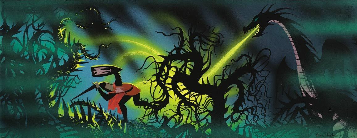
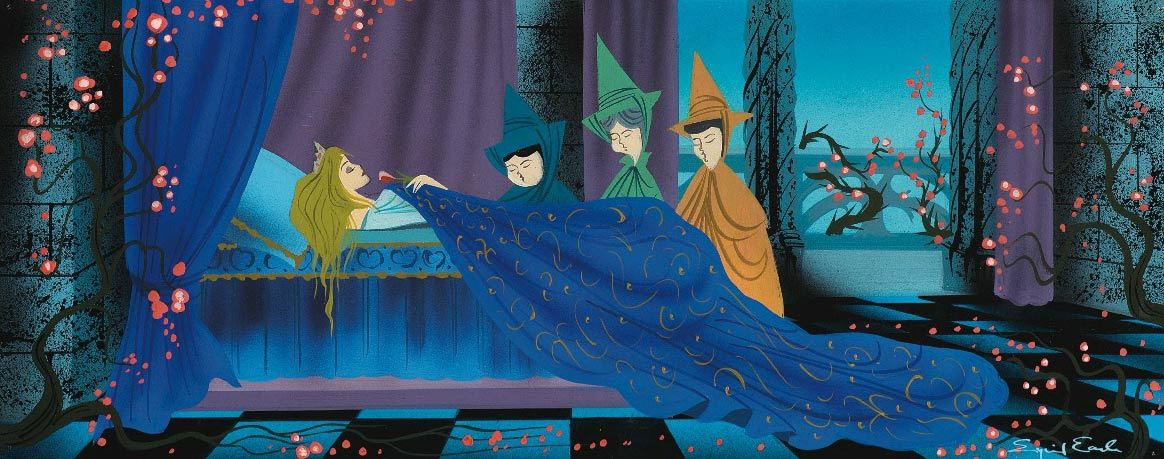
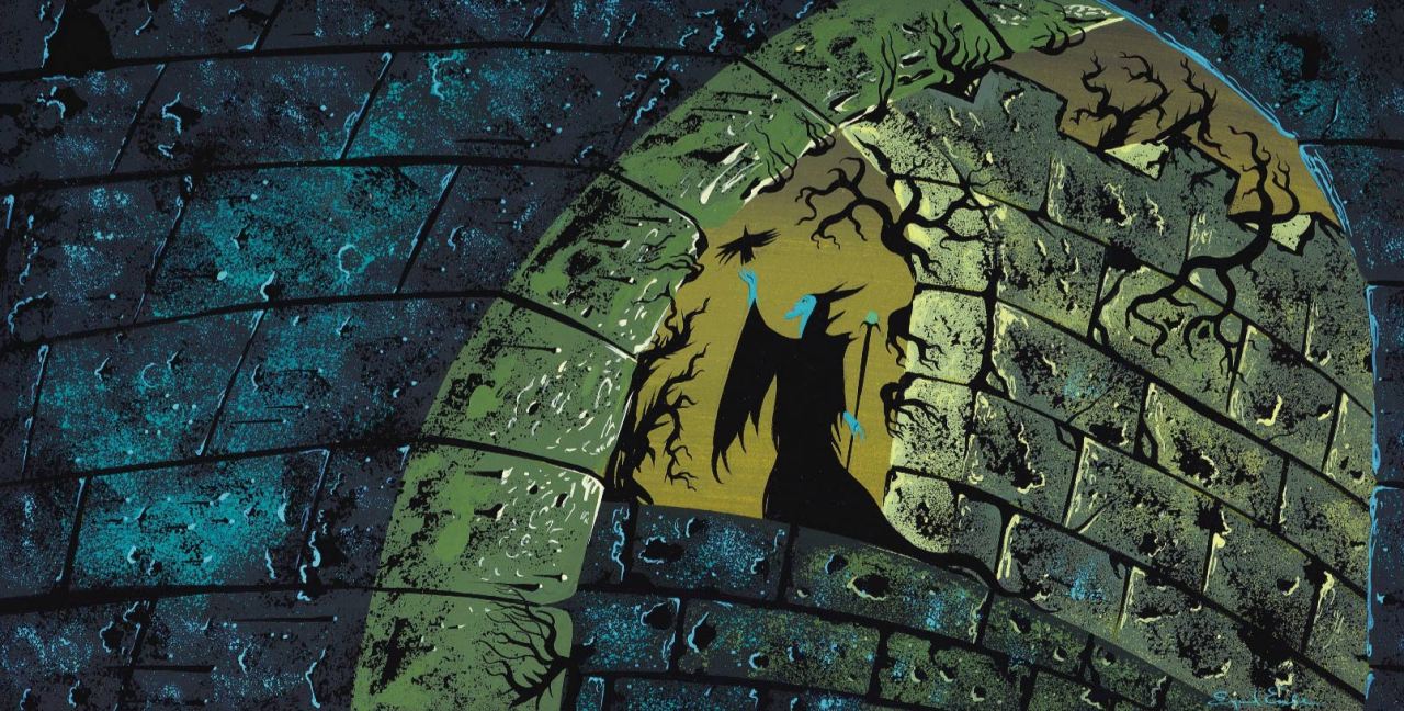
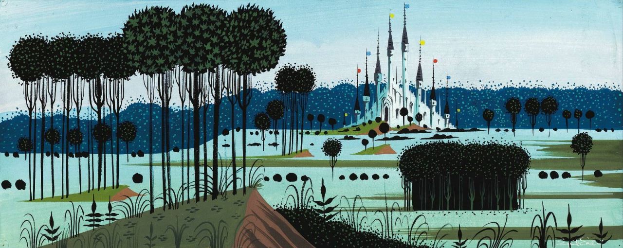
Sleeping Beauty: Concept Art

Concept art for Sleeping Beauty (1959) by Eyvind Earle.

"All my foregrounds were tapestry designs of decorative weeds and flowers and grasses. And since it is obvious that the Gothic style and detail evolved from the Arabic influence acquired during the Crusades, I found it perfectly permissible to use all the wonderful patterns and details found in Persian miniatures. And since Persian miniatures had a lot in common with Chinese and Japanese art, I felt it was OK for me to inject quite a bit of Japanese art, especially in the closeup of leaves and overhanging branches." - Eyvind Earle


I love love love this concept art, to me it perfectly encapsulates the essence of what concept artwork is about - telling a story in pictures, giving a sense of the film to come but not sticking directly to the final aesthetic style. The scenes are highly emotive and key points in the narrative, either showing important locations or pivotal plot points being acted out. The colours are rich and in this particular work the landscapes are very 2D picturesque, with hard edges and angles. It almost looks like a tapestry!

All pictures and quote source: http://cartoonbrew.tumblr.com/post/103477646877/concept-art-gallery-eyvind-earle-the-value-of

1 December 2014

Hercules by Andreas Deja

Source: Deja, A. (2014). Deja View: "I'm an Action Figure". [online] Andreasdeja.blogspot.ca. Available at: http://andreasdeja.blogspot.ca/2014/10/im-action-figure.html [Accessed 1 Dec. 2014].


"When I animated this scene with Hercules I was able to benefit from some live action reference. 
The actor who went through the motion in front of a video camera was Robert Gant.
I received a layout package which included these two enlarged print-outs from the footage. Before animating I studied Robert’s acting and actions on a TV monitor. At the same time I drew a series of thumbnail sketches as I was searching for the key poses.
I remember the live action footage being excellent, and I used most of what Robert was doing. But by not tracing photostats it is still necessary to digest the scene in your head and make it your own.

Here are the rough key poses from the scene:"
-Andreas Deja

18 November 2014

Dreamworks and Intel Animation Process


This is a short video which goes behind the scenes at Dreamworks animation studios and shows some of the animators working on 3D figures using Cintiq tablets and Intel technology. It focuses on the work of the How to Train your Dragon 2 crew.

10 November 2014

Concept Art from Monsters, Inc.

These are character designs from the early stages of production, by Nicholas Marlet. You can see that they seem quite free-form, with visible rough sketch marks still on the page. The colours are muted, to just give a suggestion or hint of the shading and colouring of the creatures. The style is spindlier and creepier than usual Disney, which shows that they have not been refined and reproduced multiple times yet in the studio. They almost look like the work of Chris Riddel, one of my favourite children's illustrators. Indeed, they look more like static illustrations than actual designs for moving, living characters. The physics of some would be too disproportionate to animate properly/ realistically.
Source: disneyconceptsandstuff.tumblr.com/post/102219297046/character-designs-from-monsters-inc-by-nicolas

These character design/concept art pieces by Carter Goodrich are even less coloured than the previous ones, and instead rely more heavily on shading and depth to convey a sense of atmosphere rather than actual form. They are pencil sketches, but intricately done, and give the additional information of the environments that the characters might appear in or the actions they will partake in. Pieces like these would be great to use in a pitch of the story, to communicate the feel and the purpose of the tale.


For neither of the above images to I have a credit for the actual artist, as it was not listed on the course site I found them on. They are taken from the visual development stage of the film, when basic setting, character, colour key etc ideas were being formulated. The picture is roughly done, in pen and marker it seem,s with just enough detail, colour and shading to suggest the look of the scene in the final finished film. Images like these might also be the kind to appear on a storyboard, as they have basic blocking included and very decisive camera angles.
Source: disneyconceptsandstuff.tumblr.com/post/102224963929/visual-development-from-monsters-inc


All of the above images are colour keys by Dominique Louis. They are painted with either pastel or chalk it seems, to give rich and complete tones to the images. These keys show the atmosphere of each scene, without the drawings being terribly intricate. It gives and sense of the mise-en-scene. In some shots, the blue colours suggest night time, loneliness, isolation and the urban, while the ones with warmer pink and golden tones are more inviting, and we expect it to be a happier scene. Yet all of these examples show the mood without even featuring actors, dialogue or plot.


4 November 2014

Mary and Max (2009)

Mary and Max was a really funny experience to watch; I decided to analyse it through the lens of the readings I have recently done about representation. I want to approach this in a theoretical sense to help be develop the theory behind my own story. Even though it is a stop-motion animation using small models, with a cartoonish aesthetic, it deals with VERY adult subject matters. The story revolves around two central figures; a young Australian girl and an older American man, who become unlikely friends. Where at first i thought the film would follow a very simple plot line and have a hopeful message and happy ending; it had lots of ups and downs in pace and story, like an emotional rollercoaster to watch!
Max's character has asbergers syndrome as we discover part way through. This brings to the forefront questions of representation: how do you portray a character with an invisible disability? It run the fine line between being very specified, and appealing to  wide audience also. It does this mainly through black humour, where we can sympathise with Max's every day struggles while also being amused (but not in a cruel way I don't think). The fact that it uses both 3rd person narration and 1st person (where Max and Mary read each others' personal letters aloud) probably makes it easier to understand life through Max's PoV, and through literal narrative description rather than through visuals alone. I think that it is definitely a benefit of having narration in a story; and I am not quite sure yet whether I want to incorporate it in to my own yet. I will have to see how easy it is to tell the story through visuals, and if I need any aural aid for this.

The lighting and colour schemes changes between the two characters' environments, representing the way they view the world around them. For Max, New York is scary and grey and bleak. It shows how I can use colours, lighting, and the surroundings of the characters to reflect the storyline, emotion and characters' personalities, rather than just relying purely on their actions.

Representation of women comes through the depiction of Mary's growth through adolescence to womanhood. She goes through a great deal of self-loathing and deprecation, which she describes verbally and we can see in her actions and reactions to her own situation. As a child, she is not in control of her place in the world. She is controlled by her family, her age, her location. Later in life she begins to grow her independence, and be more assertive.

Making of How to Train Your Dragon 2


It was interesting to see the drawing and 2D concept work that went into the 3D CG Dreamworks film. The model sheets, though we don't see them close up or at great length, look really detailed and intricately made. There are a few seconds included at different points of the animatic, so we can see really easily how the storyboard translates to the final finished film. We get interviews with the voice actors, producers, designers and character animators.

22 October 2014

Anya (2014)

Anya is an animated 5-minute short produced by Brown Bag animation studio for the charity To Russia With Love.


20 October 2014

Character Design of Tangled

Hair principles by Glen Keane

 Rapunzel as she appears in the final version of the film.

 Original character design for Bastian, who was to feature as the main love interest and male protagonist in place of Flynn Rider. Just goes to show how reviewing and critiquing work regularly is good, and revision can lead to the final product being much different but ultimately better off than the original idea.

Rapunzel's facial expressions from a variety of angles. Note: the angle of composition in most of these is >, where her eyes open wide, her jaw points downwards, her nose slopes down at an angle.


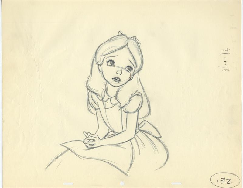
Alice in Wonderland

Mitt Kahl drawing of Alice